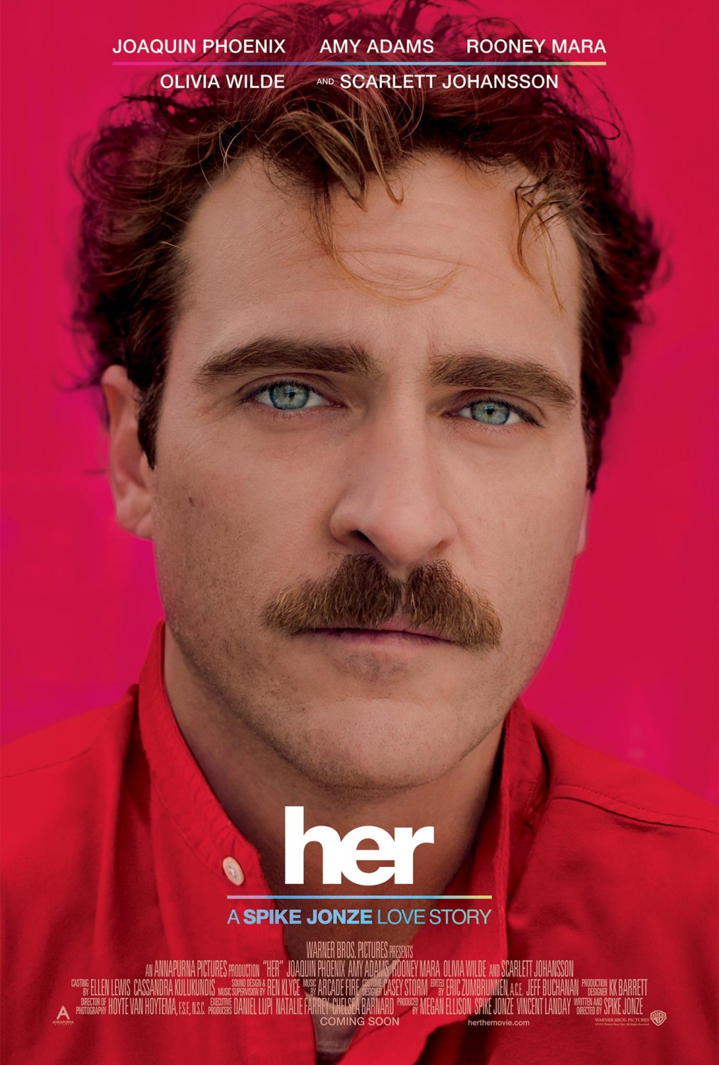
Why I like this movie poster:
- His eyes look like they're filled with emotion, which I think matches perfectly with the movie
- Simplicity
- text placement
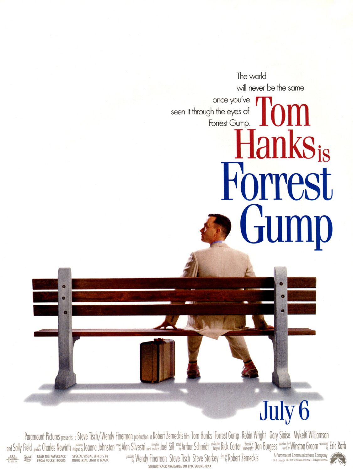
What I like about this movie poster:
- How that bench is a somewhat big part in the movie
- More simplicity
- The photo and how it shows so little about the movie but then shows a lot after watching it
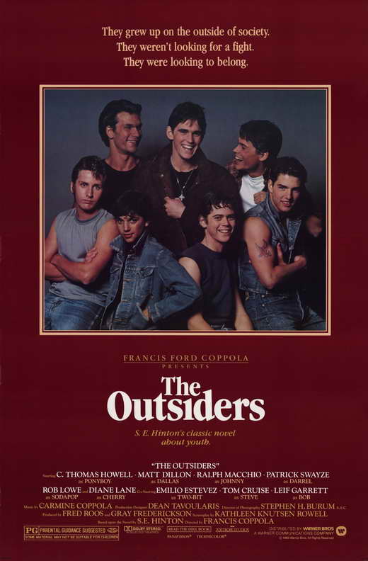
What I like about this movie poster:
- The characters are in the poster. But it doesn't look crowded
- Simplicity. Again. It's not filled or crowded looking
- The movie poster becomes a book cover later